Gabriel Ziembicki
Poland's Solar Map: Where Capacity Is Concentrating and Why Location Matters
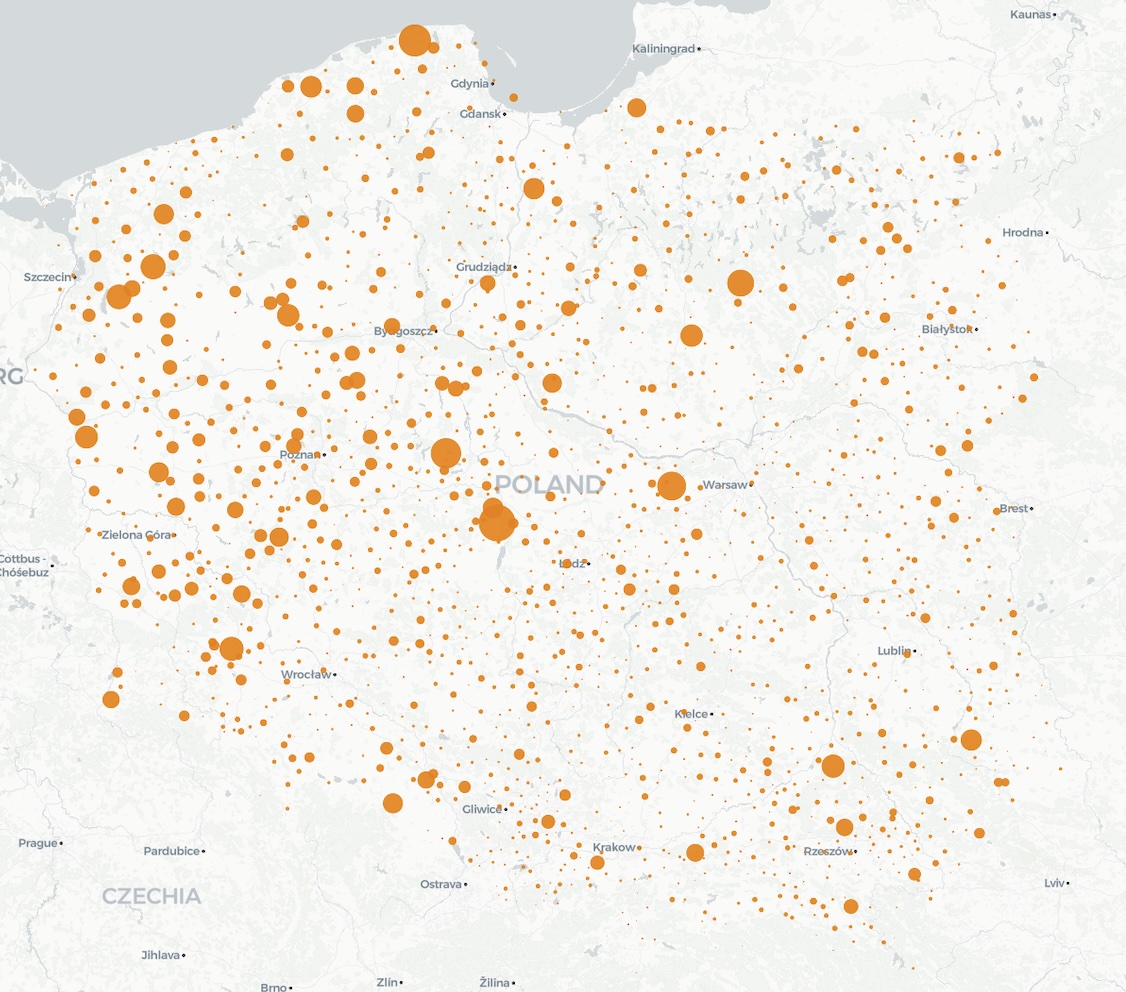
Poland now has a nationwide solar fleet — but capacity is clustering, not spreading evenly. The top 1% of installations account for 28% of capacity. Geographic concentration drives correlated output, congestion risk, and curtailment exposure.
The top 1% of Poland’s non-prosumer solar installations account for 27.8% of total capacity. The top 10% account for more than half. That concentration shapes the market in ways that national averages completely obscure.
We spend a lot of time looking at aggregate numbers — total installed GW, system-wide capture factors, monthly generation statistics. These are useful for tracking the big picture, but they hide the question that matters most for anyone actually developing a project: where is all that capacity, and what does the local grid look like?
A nationwide fleet — but not an even one
The first thing the map shows is sheer scale. PV is no longer a handful of pilot projects scattered across the countryside. It is a nationwide fleet with installations in virtually every region. That density means midday output is increasingly correlated across the country — when the sun shines in central Poland, it usually shines in eastern Poland too. There is no significant geographic smoothing of the kind you get with wind, where different weather systems can produce high output in one region and low output in another.
But within that national footprint, the distribution is far from uniform. Clear pockets of higher concentration are visible — areas where grid connection availability, land costs, and proximity to substations have attracted disproportionate development. These clusters are where we expect the highest congestion risk and curtailment pressure during sunny hours.
Concentration by the numbers
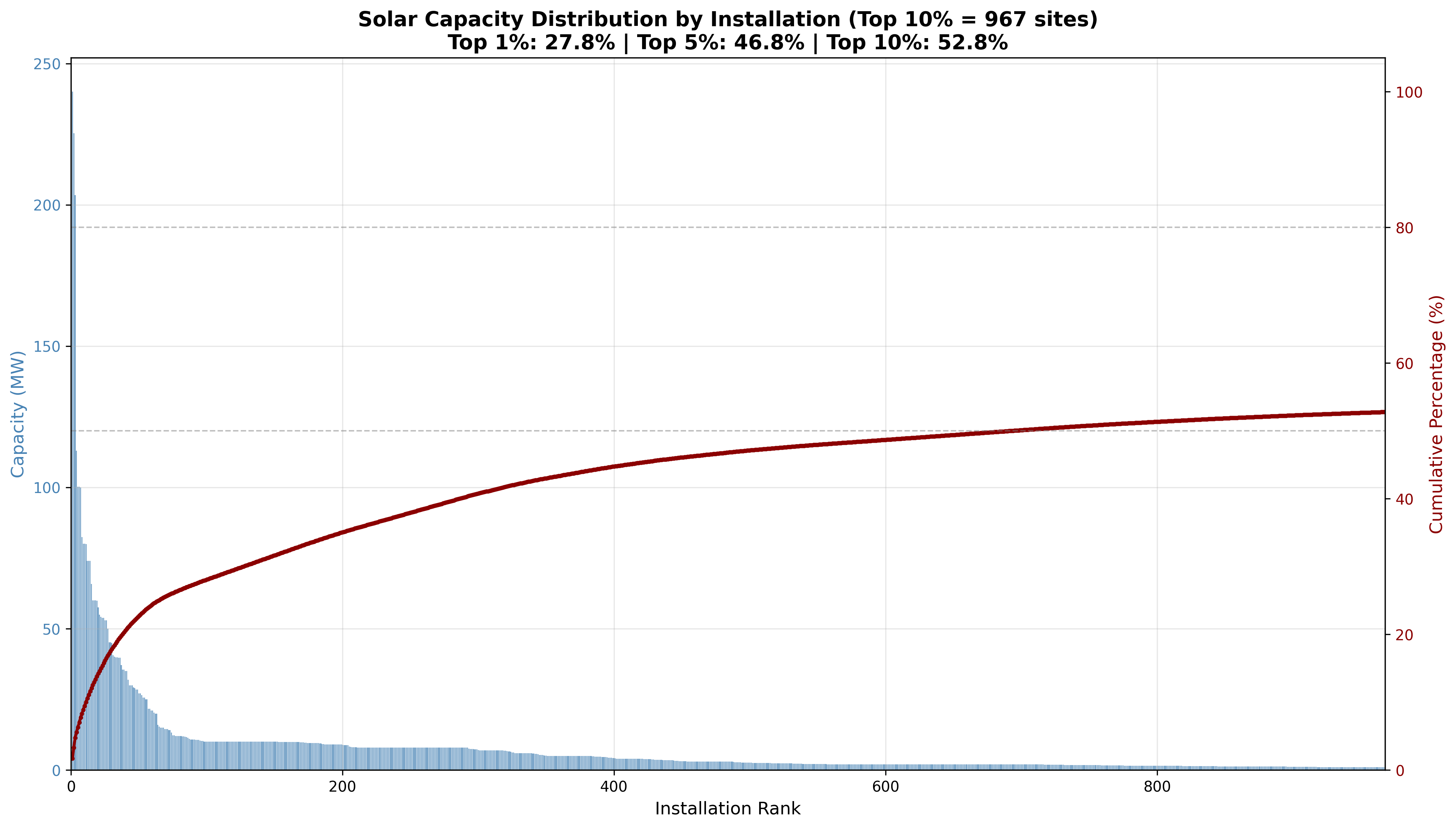
The skew is steep: 27.8% of capacity in the top 1% of sites, 46.8% in the top 5%, 52.8% in the top 10%. A small number of large installations — many in the same regions — drive a disproportionate share of the country’s PV output. When those sites produce, they produce together, flooding local grid infrastructure and the wider wholesale market simultaneously.
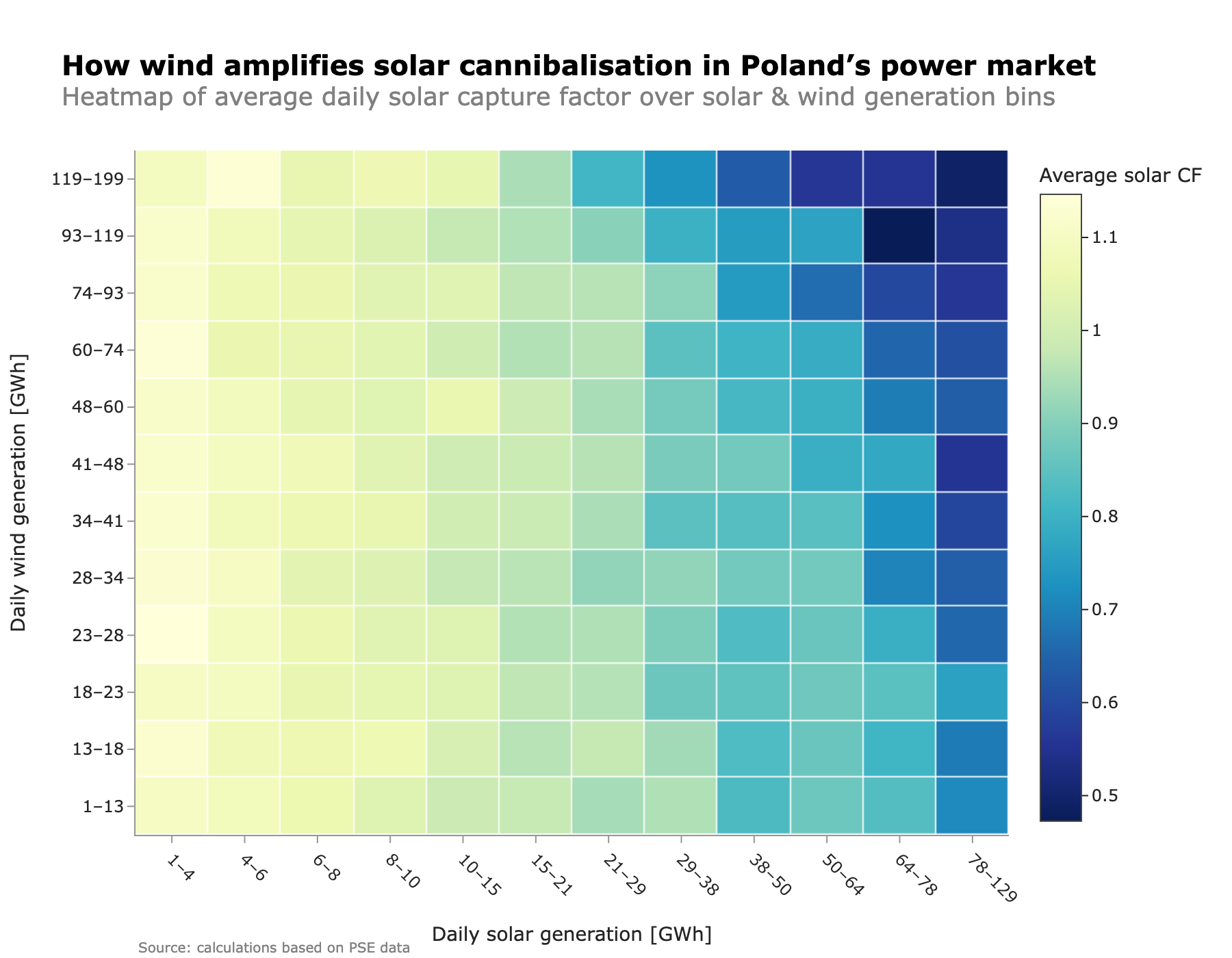
What clustering means for capture and congestion
Geographic concentration amplifies cannibalization. As we explored in our analysis of how capture factors erode with penetration, solar revenues fall because output is concentrated in the same midday hours. When a large share of capacity also sits in the same region, the correlation of output is even tighter than the national average suggests. Every sunny hour produces a more synchronized surge, pushing the single national wholesale price down faster.
Grid congestion is becoming a real constraint. Poland’s transmission and distribution networks were not designed for large-scale bidirectional flows from solar farms. When concentrated clusters produce at peak, the local grid can reach its limits — leading to curtailment, redispatch, or connection constraints for new projects. This is not yet a system-wide issue (as we noted in our solar capture factor analysis, non-market redispatch affected around 11.5 GWh of solar as of mid-2025), but it is increasingly a real problem in the most concentrated areas.
And here is what we think is underappreciated: in a system with clusters, the national capture factor is a poor proxy for any individual project’s revenue. Poland operates as a single price zone, so all generators see the same wholesale price — but a project in a heavily concentrated area faces higher curtailment risk and grid connection constraints than the national average suggests. Curtailed MWh earn nothing regardless of the market price.
Will the next wave spread or reinforce?
The economics that created today’s clusters are still in place. Grid connection availability remains the primary bottleneck, and areas with existing connections attract more development. Land prices, permitting timelines, and local political support vary significantly across regions, creating persistent advantages for some locations.
Several forces could push the next wave elsewhere. Grid investment plans include new substations and reinforcements that could open up underserved regions. If Poland ever moves toward more granular market design — whether through locational marginal pricing or nodal signals — it would penalise development in oversupplied areas and reward it in constrained ones. Even without such reform, the physical reality of grid congestion already creates de facto location risk through curtailment. And co-located storage, as we discussed in our analysis of BESS and solar economics, can reduce a project’s exposure to midday curtailment by shifting output to other hours.
We expect clustering to persist in the near term, though. The incentives point that way, and grid reinforcement moves slowly. For projects in the most concentrated areas, the physical constraints — curtailment and connection delays — are already material enough to factor into any serious development plan.