Gabriel Ziembicki
Solar Cannibalization in Poland: How Capture Factors Erode as Renewables Scale
Solar capture factors in Poland have fallen below 50% in peak months — and the decline accelerates with penetration. A two-dimensional look at how both solar volume and wind output shape PV revenues, and what the curve ahead looks like.
In June 2025, Poland’s solar capture factor hit roughly 50%. That means PV generators earned about half of the average wholesale price for an entire month. Most analyses explain this through a single lens: more solar capacity pushes midday prices down. That is true, but it is only half the story.
We mapped solar capture against two variables simultaneously — solar output and wind output — and the picture that emerges is more nuanced and, frankly, more concerning. Wind conditions shape solar revenues nearly as much as solar conditions do, and the interaction between them creates a cannibalization pattern that one-dimensional models will consistently miss.
In our earlier analysis of PV capture factors, we showed the overall trend as installed capacity passes 23 GW. Here we unpack the mechanics.
Cannibalization is multi-dimensional
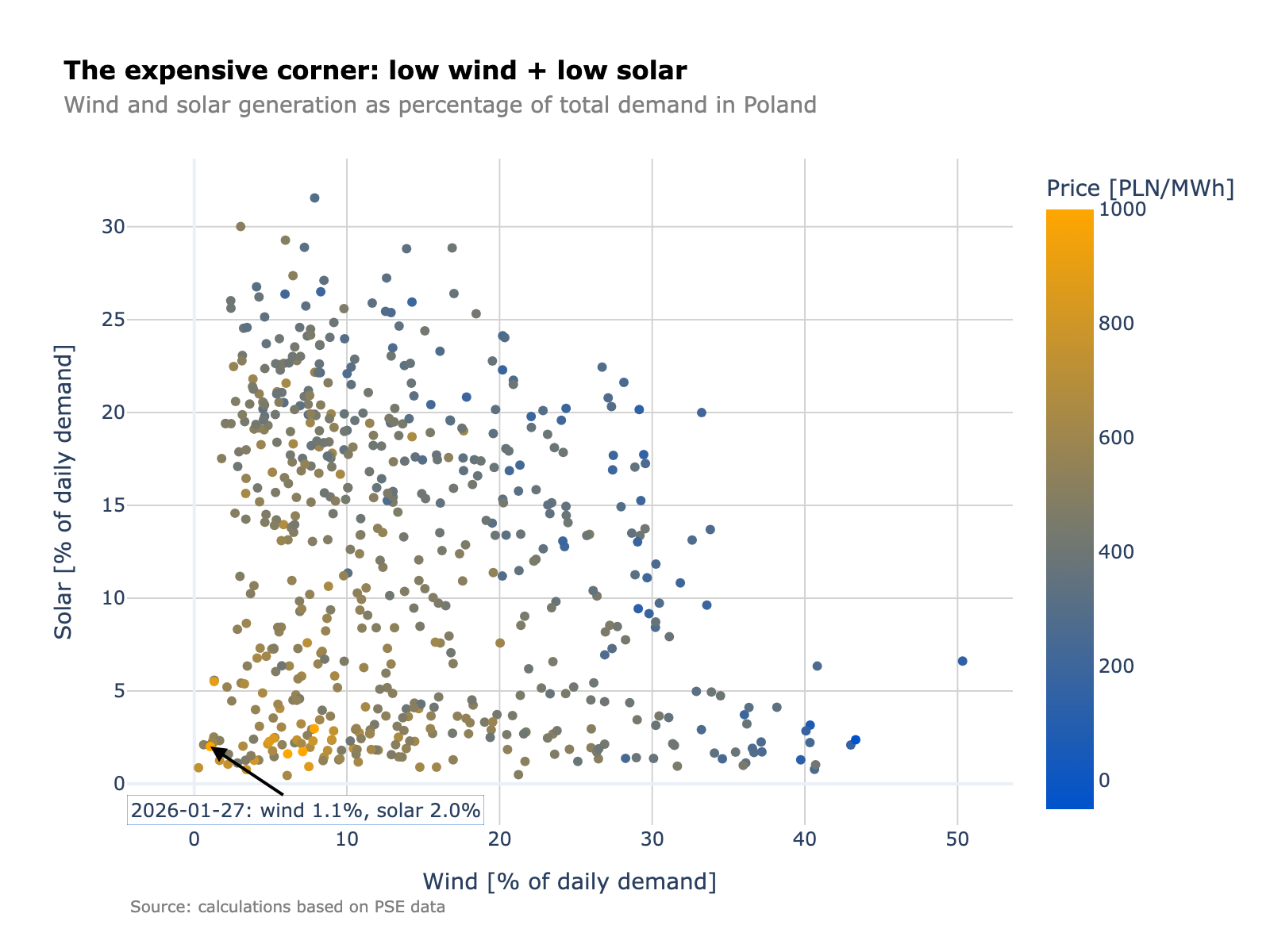
We mapped the average daily solar capture factor on a grid: daily solar generation on the x-axis, daily wind generation on the y-axis. Each cell shows the average capture factor for days that fell into that particular solar–wind combination.
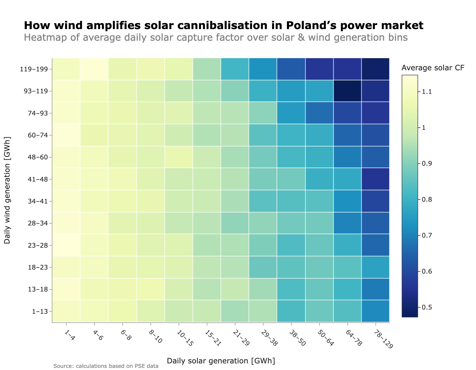
The bottom-left corner is bright — capture factors above 1.0. When both solar and wind are scarce, PV shows up in a tight system and earns more than the average market price. These are the days that pull up solar’s annual average. There are fewer of them every year.
Move right along the x-axis and the familiar self-cannibalization kicks in. By the time daily solar generation exceeds 60–70 GWh, the capture factor drops below 0.7, even on low-wind days. More PV output, lower midday prices — the basic mechanism everyone talks about.
But now move up the y-axis. More wind on top of the same solar output drags the capture factor down further. Wind pushes wholesale prices lower across broader hours, covering residual demand that would otherwise support midday prices. Solar gets squeezed from both sides.
The worst corner — high solar plus high wind — shows capture factors below 0.5. Solar earns less than half the average market price. We think this interaction is systematically underappreciated in most revenue projections, which tend to model solar capture as a function of solar penetration alone.
How wind reshapes the price profile across conditions
The heatmap shows the outcome. The small multiples chart below shows the mechanism — average daily price profiles broken down by solar and wind conditions (low / medium / high, based on percentile buckets). The orange line is the baseline for each solar level across all wind conditions. The blue line shows how a specific wind level shifts the profile.
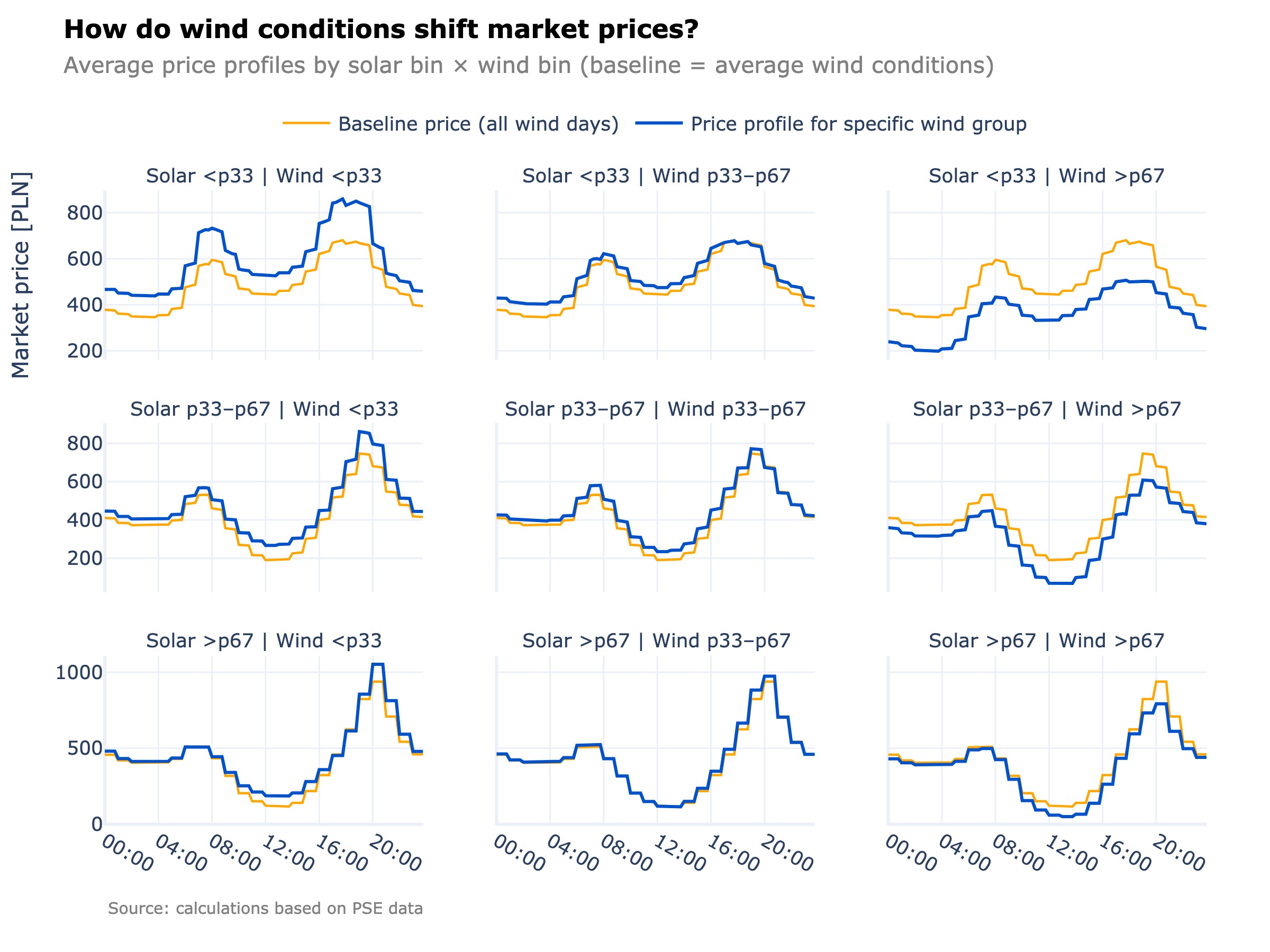
The effect is different depending on conditions.
On high-solar days (bottom row, mostly summer), wind mainly moves the midday trough and the evening peak. Night-time prices stay relatively stable, but high wind pulls the evening peak down by roughly 150 PLN/MWh below baseline — while low wind lifts it by about 110 PLN/MWh. That evening recovery is what partially offsets the midday collapse for solar assets. Wind conditions determine whether it actually shows up.
On low-solar days (top row, typical winter), wind shifts the entire profile. High wind pulls the whole curve down across all hours — day and night. Low wind pushes it up and accentuates the two-peak structure, with higher and longer-lasting evening prices. In this regime, wind is not just affecting solar’s midday hours. It is reshaping the entire daily price landscape.
For anyone holding both wind and solar assets in Poland, this creates an uncomfortable dynamic. The diversification benefit is real — the two technologies rarely both produce at full output simultaneously. But on the days when they do, the portfolio effect reverses: both assets earn depressed prices at the same time.
The penetration curve: how fast does value erode?
The heatmap tells us about individual days. The structural question is different: as renewable penetration grows month by month, year by year, how does the capture factor trend?
We plotted each month’s renewable share of total generation against the capture factor for that month, separately for solar and wind.
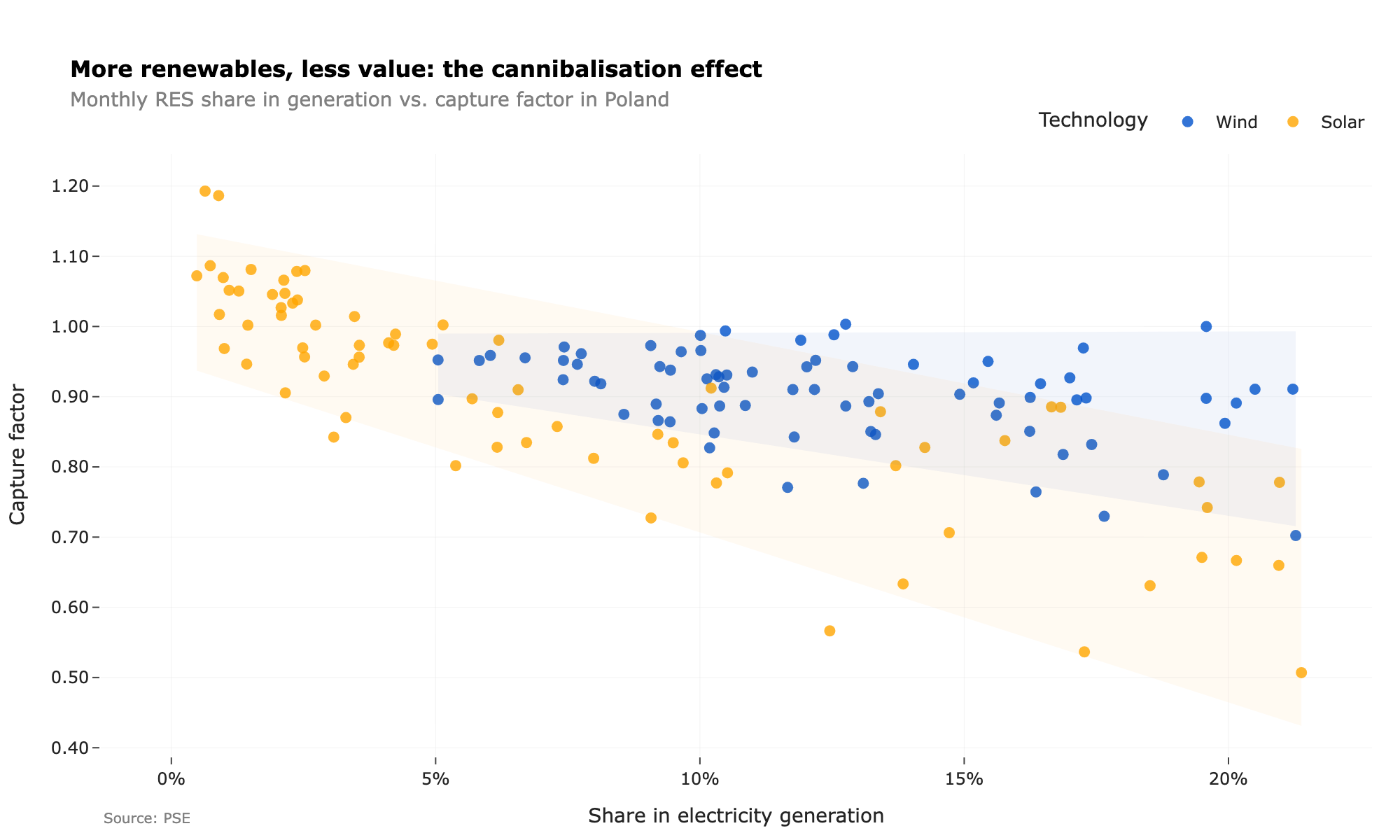
Both technologies see falling capture factors as their share rises. But the rates are strikingly different.
Solar drops fast. PV output is packed into a narrow band of midday hours, so each additional percentage point of penetration concentrates more generation into the same window. The lowest solar capture factors in the data — around 50% — correspond to months where PV’s share of generation reaches roughly 15–20%. Half the average market price, for an entire month. That is not a blip.
Wind erodes more gently. Its output is distributed more evenly across the day, so the price suppression it causes spreads over more hours. Even at monthly wind shares above 15%, capture factors typically stay in the 0.7–0.9 range — noticeably higher than solar at comparable penetration levels.
This asymmetry matters for investment decisions. As Poland’s PV fleet continues to expand, each new GW of capacity will erode value faster than the last. The cannibalization curve is not linear — it steepens. Wind faces a gentler slope, but it is not immune. As both technologies scale together, the joint pressure documented in the heatmap above will intensify.
What does this mean going forward?
We see three practical conclusions.
Revenue models that project solar capture based only on expected solar output will systematically overestimate returns. Wind conditions — and the correlation between wind and solar output on high-RES days — must be part of the model. The heatmap above gives a concrete framework for that.
The cannibalization curve is non-linear, which means linear extrapolation from historical data will underestimate future value erosion. Each marginal MWh of solar enters an increasingly saturated midday market. If your financial model assumes a steady decline rate, it is probably too optimistic.
Flexibility becomes the binding constraint. As we explored in our analysis of how batteries change solar economics, co-located storage can lift an individual asset’s captured value by 49–61%. But at a system level, the question is whether flexibility — storage, demand response, interconnection — can scale fast enough to absorb the growing midday surplus before capture factors fall to levels that make new PV unfinanceable.
We will keep tracking what happens to these curves as Poland’s RES share moves materially higher than the 20% monthly peaks observed so far. Does solar settle near some floor, or does the erosion continue? The answer will depend less on how much capacity gets built and more on how much flexibility the system adds alongside it.